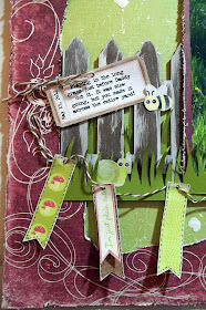
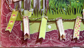
I put together a layout this weekend based on
Challenge #20 at Color, Stories, Inspiration and used the
May Sketch at C'est Magnifique as inspiration for the layout. This layout is a departure from my normal style - it is very cute and 'scenic', which is totally not my norm - but I'm really happy with how it turned out. I'm a little embarrassed to admit that the picture was taken in my backyard a couple of weeks ago - with the length of that grass, one would think it was an untended field somewhere (the grass has been cut since this picture and looks much tamer now....;).
I used an older Prima collection for the patterned papers for this layout - I used two papers with the same swirly pattern, but in different colours, from the Angelique collection. I cut the centre out of the red sheet with my craft knife and distressed the inside and outside edges of the paper. I splattered the green (base) page with craft paint in Light Antique White and also added some larger paint drops. I used 3D foam adhesive to attach the red patterned paper on top of the base page.

I altered the sketch slightly and used a fence instead of a birdcage - I also switched the positioning of this large design element and moved it to the left side (rather than having it come down from the top of the page). I "white-washed" the fence using the same paint that I used for the splatters on the base page. I cut the fence and some of the grass sections using my silhouette; however, the longer grass section on top of the photo was cut by hand. I staggered the heights of the three sections of grass and layered one section in behind the fence so only a few blades would peek through the fence boards.

I used the CSI Co-ordinates as the embellishments for my layout. The journalling ticket, banner elements, insects/bugs and mushrooms are all from the "Word Art" and "Spots" pages of the co-ordinates. I used the white paint to 'ink' the edges of all the embellishment pieces. I used baker's twine to tie the journalling ticket 'on the fence' and as the string for the banner and added faux stitching to the banner pennants using a memory marker.
For the title, I used a piece of the fence (which I had cut down to the size I wanted) and turned it horizontal. I printed the title on white cardstock and cut it as a double-ended pennant and attached it to the white-washed fence board with 3D foam adhesive. I also added baker's twine to this embellishment and a small brad to make it look like a hanging sign.
That's it for today - thanks so much for visiting my blog!
Materials Used:
Patterened Paper: Prima "Angelique" Collection - Angel Breath and Angel Kisses; Recollections cardstock in white and olive green; DecoArt Acrylic Craft Paint in Light Antique White; CSI Coordinates #20 Word Art and Spots; We R Memory Keepers Sew Easy Fancy Floss Baker's Twine Neutral; Memory Maker (Black); brad from stash; Ghostwriter font; Silhouette Die Cut Machine; Zots - small; Glue Dots - Memory Book; Memory Tape Runner XL


