And here is the November 2012 Recipe Challenge that inspired it:
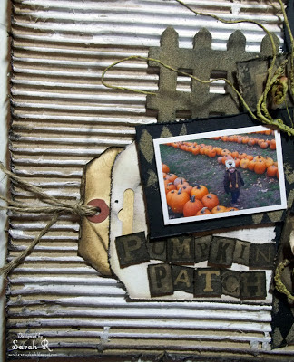
I had a lot of fun with this layout - using lots of different "recycled" items. I stuck with a neutral palette and started off by creating my own background using a 12x12 piece of cardboard that I cut out of a box from one of my scrapbooking kits. I peeled off the top layer of the cardboard to reveal the corrugated paper underneath and then brushed some gesso across the corrugated cardboard; finally, I distressed and inked the edges of the cardboard background with Distress Ink in Walnut Stain. I recycled a piece of Prima packaging (lightly coated with gesso, distressed and inked), a tag (distressed and inked) and a page out of a dictionary (if you look closely, you'll see its the page with "pumpkin" on it) to use in my layering. I've also used some plain black cardstock and some elements from Tim Holtz's Kraft Resist papers (Kraft Resist and Kraft Resist - Halloween Haunts). Lots of distressing and inking on all the papers for this layout. Here are a couple of close-ups of the layering.
I used a Crafter's Workshop template (Harlequin) with some Distress Embossing Ink and Distress Embossing Powder in Vintage Photo to create the diamond Harlequin pattern on the black cardstock paper. For the banner, I added some small Halloween postcards from the Kraft Resist Halloween Haunts paper, and strung the banner using some metallic eyelets and twine (i.e. fibre).
For my embellishments, I've used a small wooden picket fence (Michael's Bargain Bin) and a Chipboard door - both of which were embossed with Distress Embossing Powder in Vintage Photo and inked with Distress Ink in Walnut Stain. I used some Prima flowers, which I slightly altered by inking them so that the coordinated better with the layout. I also used a Prima vine - I thought this was appropriate for a Pumpkin Patch layout (i.e. pumpkin vines....) and love how it looks on the layout. The title letters are cut from the Kraft Resist - Halloween Haunts papers, distressed and inked with Distress Ink in Walnut Stain.
Thanks so much for stopping by my blog today. I hope you'll check out the November Challenge at The Paper Mixing Bowl too!


4 comments:
..what an interesting layout! Love the background and the "dark" look of your composition! Nice work!!!
stunning page, love all the background, cute photos too :)
What a darling LO!! Love the corrugated background and mix of layers behind your photo!! ~ Blessings, Tracey
http://gracescraps.blogspot.com/
Gorgeous page Sarah!!!! love it!!1 and the pics are so lovely!
Take care!! xoxo
Post a Comment