Showing posts with label Photo Editing. Show all posts

Tuesday, March 4, 2014

You Are Every Lovely Word I Could Ever Think Of ~ Scraps of Darkness

I have been creating with the utterly FANTASTIC Scraps of Darkness February Touch of Grey Kit, which features (among many other things) Kaisercraft's gorgeous "Art of Life" collection. I created this layout, featuring my handsome little boy, based on Kaisercraft's Saturday Sketch for March 1st. Here is my layout, entitled "You Are Every Lovely Word I Could Ever Think Of" (from one of the pieces from the "Art of Life" collectibles).
And here is the Kaisercraft Sketch:
I had lots of fun creating this layout - I took my inspiration from the Always paper and wanted the layout to look like a cluttered desktop - complete with spilled tea and tea rings! (My son saw me doing the tea staining and said "Mommy, what are you doing? You're supposed to drink tea!.")
I used pieces from the "Art of Life" Collectibles (Embellishments Add-On) and from the Loved paper to create the distressed layering under the photos, as well as some Dusty Attic Chipboard from my stash - which I painted with black gesso and then embossed with a light dusting of Lindy's Stamp Gang Embossing Powder in Golden Angel Wings (Colour Add-On). Once I had completed the layering, but before adding the photos, I splattered the layout with Lindy's Stamp Gang Starburst in Opal Sea Oats (CAO). I used photoshop to create the "polaroid" photos - using a polaroid frame template I found online and photos of my son, which I converted to black and white.
To embellish the layout, I wanted to make it look like someone had emptied their pockets onto the "desk", so I added a wooden domino that I distressed with sandpaper, tiny coins taken off an old necklace, a 7 Gypsies vintage safety pin, a metal key and keyhole and some wooden buttons (EAO), which I had soaked in tea to alter the colour. Finally, I added a Prima Flair button and two Prima mini-clothespins, rubbed with Tim Holtz Vintage Photo Distress Ink, to the photos.

Just a note - we are currently having a Gallery Upload Challenge for SOD/SOE Kit subscribers - check out the details here - you could win your Main Kit free!

Thanks so much for visiting my blog today! Come back soon for some more inspiration with the Scraps of Darkness Touch of Grey Kit!
Saturday, January 11, 2014

Snow Angel ~ Scraps of Darkness

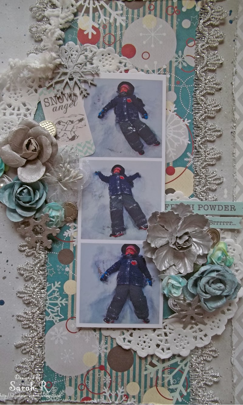
Hello Scrappy Friends! I have a fun layout to share with you today - created with the Scraps of Darkness December "Winter Wonderland" Kit! I've used the Fancy Pants Designs "Timbergrove" papers to create this layout featuring photos of my son making a Snow Angel this winter!
I started out with the Frolic chevron-patterned paper as the base and then used the reverse side (a light grey) as the second layer and paint-splattered it using watered-down gesso, as well as two of the Silks Acryclic Glazes (Silver Bells and Bolivian Blue) included in the Colour Add-on.
I cut out the central pattern from the Flurries paper and used it as the vertical strip to anchor my photos and embellishments and added the Silver lace from the Embellishment Add-on along the vertical sides. I cut two circles from the leftover Flurries paper for the centre of the doilies. For the photos, I created an "Instagram" photo strip using Photoshop Elements to play upon the vertical lines of the layout.
Finally, I used a combination of flowers (Prima, Petaloo and Kaisercraft) from the Main Kit and Flower Add-On, some Authentique Cardstock stickers (painted with Silks Acrylic Glaze in Ice), Leaky Shed Studio Chipboard snowflakes (painted with Gesso and Silks Acrylic Glaze in Silver Bells), as well as some Farmhouse Studio brads to create the flower clusters.
Thanks so much for stopping by my blog today - hope you enjoyed this fun layout!

Saturday, May 11, 2013

c.1979 Details and Close-ups ~ ScrapThat! May Kit ~

This is my second layout with the ScrapThat! May Kit - featuring the Prima "Divine" collection. For this layout, I used the Prima BAP sketch from April and an old picture of my sister and I playing at the beach (in Florida?) - I'm not sure when it was taken, but I think it was probably late in 1979, hence the title of the layout "c. 1979". I used just one sheet of patterned paper for this layout. I watered down some acrylic paint in a spray bottle and spritzed the paper to create the painted background and paint drips. I used a toilet paper roll dipped in watered-down acrylic paint for the drippy circles. I wanted the colours to look beachy but also wanted a very 1970-ish colour palette - I think the coral, teal and brown were perfect for this!
I printed the photo on the vellum included in the kit (I must give kudos to my scrappy-friend Miranda Edney for the inspiration to do this - love her layouts where she prints photos on transparency paper). I used a Prima 'doll' tag from my stash as the mat for the photo - I love how the vellum photo adds to the vintage-feel of the layout and how you can see some the script on the tag through the photo. I added some sisal twine from my stash around the photo and a Prima clip from the Main Kit to the corner.
The flowers are from the Flower Add-On love how they matched my coral paint drips so perfectly! The random Kaisercraft pearls were a perfect little addition to tie in the beachy theme.
The title and hexagons are chipboard from Imaginarium Designs. I painted them with the same colours of acrylic paint as I used for the circles/sprtizing/drips. I then stamped the hexagons with a Prima Sunrise/Sunset stamp using Memento Dye Ink in Rich Cocoa. Finally, I finished off all the Chipboard elements with a thick coat of Distress Paint in Clear Rock Candy. Here are some close-ups of some of the stamped hexagons.
I'll be back tomorrow with details of my final layout with this kit! Thanks so much for stopping by my blog today!

Wednesday, April 3, 2013

Shattered - Details and Close-ups (ScrapThat! April 2013 Kit)

Good Morning Scrappy Friends! Over the next few days, I'm going to share the details and close-ups of my ScrapThat! April "Within Nature" Kit creations with you. Today, I'm sharing the story of my Shattered layout. This layout is based on the March 15 Sketch at Another Freaking Scrappy Challenge and is sort of a companion piece to the Through the Looking Glass layout that I created in January.

This is a pretty personal, revealing layout for me. I'm a very private person and don't often share my 'troubles' with others - but I've been dealing with some personal issues lately and sometimes it is cathartic to release some emotion through artwork. So this layout describes how I have been feeling - shattered - but I'm picking up the pieces and putting things back together - re-evaluating my priorities and what is important to me.
Enough about me - let's get down to the nitty gritty of the layout. I started out with one of the sheets of patterned paper in the Main Kit - the 'Soaring' page and used the lighter coloured side as the base page for the layout. I used the Prima 12 x12 Crackle stencil with some Heavy Gel Medium to get the crackled effect on the base page and then misted it with two shades of smooch spritz (Splash and River Mossy).  Here is an angled shot of a section of the layout that better shows the crackle effect.
I did some stamping around the edge of the layout and where I was placing the title with a Kaisercraft Texture Stamp (Crackle) and black ink. I cut the torn 'notebook' paper edge using my Silhouette Cameo and tore the other paper strip for the paper embellishing in the top left of the layout.
I added a white smudged circle under the photo with gesso (you can just see the edges of the circle) and did some simple embellishing using the chipboard sign and roses that were included in the Main kit. I separated the chipboard sign and used the two elements to frame the photo. Once I had the chipboard and flowers in place, I did some more misting with Smooch Spritz in Black Velvet. I also added some Distress stickles in Clear Rock Candy to the chipboard elements after the misting had dried. Finally, I added some vinyl letter stickers from my stash for the title.
Thanks so much for visiting my blog today! Come back tomorrow for details about my Sweet Puppy layout with the ScrapThat! April Kit.

Monday, March 18, 2013

Photoshop Elements Photo-Editing Tutorial

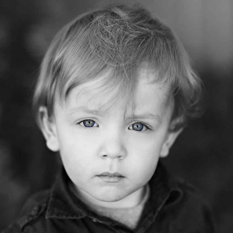
Today I'm sharing a photo-editing tutorial with you about how to convert a photo to black and white but then re-reveal a certain colour element from the photo. I used this technique on the photo that I used in my "Those Eyes" layout, created using the ScrapThat! March Kit.  I converted this photo of my son to black and white, but then revealed his beautiful blue eyes!

Here is the step-by-step procedure to create this photo effect using Photoshop Elements.

1. Open the picture you want to edit in Photoshop Elements.
2. Crop the photo to the size/shape you want. For this I chose a 5x5 crop to get a square photo.


3. Under the “Layer” tab, choose “New Adjustment Layer” and then “Gradient Map”. This will create a black and white layer over your original picture, converting the image to black and white. 

Note: If your image isn’t black and white, check the Gradient Map options in the Layers palette on the right side toolbar and ensure the correct (i.e. black and white) colour profile is selected.

4. We’re now going to restore the colour to the eyes of the photograph. On your layers palette, the gradient map layer has two thumbnail icons. The thumbnail on the right is the layer mask, which lets you alter your adjustment by painting on it. White will reveal the adjustment, while black will block it. Zoom in on the eyes in the photo so they fill your workspace. 

5. Choose the brush tool from the left hand toolbar, adjust the brush size (top toolbar), and set the opacity to 100%. Set the foreground color to black (shortcut to do this is to press D, then X). Now click on the layer mask thumbnail in the layers palette and then begin painting over the eyes in the photo.

6. If you’ve coloured outside the "lines", you can fix it easily. Switch the foreground color back to white (press D then X), undo the colouring in the areas you want. In this photo I fixed some of the skin colour that was showing on the right eyelid.

7. You can set your zoom back to 100% (or fit screen) to see the result of the revealed eye colour.

8. As a final finishing touch, we’re going to add some graininess to the photo to make it look a bit more “vintage”. Under the “Filter” menu, choose “Noise” and then “Add Noise”. 

9. Set the noise amount between 3-5%, and make sure “Gaussian” and “Monochromatic” are checked.

That’s it – you’re done your photo editing - here is the final photo!

I hope you found this tutorial helpful! Please leave a comment and a link if you decide to give this a try!


Thanks so much for stopping by my blog today!