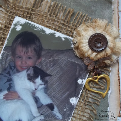
I did some masking with moulding paste and then spritzed it with Perfect Pearls mist in Heirloom Gold - I also did some inking on the masked area with Distress Ink in Vintage Photo. Not entirely happy with the masking, but it was an experiment. (They can't all turn out perfectly, right?) The layered strips of paper at the bottom of the layout were created with the same punches I used around the outside of the page. I also added in the Prima heart charm string embellishment from the EAO to finish off the layering here. I matted the photo on the burlap from the MK - which I frayed all around the edge to add to the rustic/vintage look of the layout.
I used the Prima flowers from the FAO, as well as some leftover flowers from the March Kit FAO to create the flower cluster. I cut the burlap leaves with my Tim Holtz Tattered Leaves die and fussy cut some butterflies from the Nancy's Mushroom paper to add to the flowers. I used the Chipboard Alphabet Stickers for the title and inked them with a generous amount of Distress Ink in Vintage Photo.
Finally, I added a small flower cluster with a butterfly and leftover charm to the top right of the photo. This flower originally had a more ornate centre, so I ripped that off and added the brown button so that it coordinated better with the other flowers. I also had to ink the edges of this flower and the smaller flower in the larger cluster (since they were all natural originally). Great detail shot of the photo and sanding here too!
Well, that is my final creation with the ScrapThat! April kit - I actually have LOTS of paper and things leftover, so I'm sure that I'll be able to get at least another layout or two out of the kit and add-ons!
I hope you've enjoyed the details/close-ups I've shared over the last few days. Thanks so much for stopping by my blog - I appreciate your visits and comments so much.


2 comments:
I think your layout is absolutely gorgeous! I love everything about it, the colours you used, the burlap, the flowers....everything!
WOW! This page is so beautiful and full of amazing details for your page. I just love your take on the sketch. Such a fun photo and cute story behind it, too!
Post a Comment