Wednesday, May 30, 2012

I'm on the Watch List at CSI!

I was very excited today to see that my layout Into the Wild is on the Watch List at CSI!

Check one Scrapbooking Goal off of my 2012 List!
 

Monday, May 28, 2012

Into The Wild - CSI #20

I put together a layout this weekend based on Challenge #20 at Color, Stories, Inspiration and used the May Sketch at C'est Magnifique as inspiration for the layout. This layout is a departure from my normal style - it is very cute and 'scenic', which is totally not my norm - but I'm really happy with how it turned out. I'm a little embarrassed to admit that the picture was taken in my backyard a couple of weeks ago - with the length of that grass, one would think it was an untended field somewhere (the grass has been cut since this picture and looks much tamer now....;).
I used an older Prima collection for the patterned papers for this layout - I used two papers with the same swirly pattern, but in different colours, from the Angelique collection. I cut the centre out of the red sheet with my craft knife and distressed the inside and outside edges of the paper. I splattered the green (base) page with craft paint in Light Antique White  and also added some larger paint drops. I used 3D foam adhesive to attach the red patterned paper on top of the base page.
I altered the sketch slightly and used a fence instead of a birdcage - I also switched the positioning of this large design element and moved it to the left side (rather than having it come down from the top of the page).  I "white-washed" the fence using the same paint that I used for the splatters on the base page. I cut the fence and some of the grass sections using my silhouette; however, the longer grass section on top of the photo was cut by hand.  I staggered the heights of the three sections of grass and layered one section in behind the fence so only a few blades would peek through the fence boards.
I used the CSI Co-ordinates as the embellishments for my layout. The journalling ticket, banner elements, insects/bugs and mushrooms are all from the "Word Art" and "Spots" pages of the co-ordinates. I used the white paint to 'ink' the edges of all the embellishment pieces. I used baker's twine to tie the journalling ticket 'on the fence' and as the string for the banner and added faux stitching to the banner pennants using a memory marker. 
For the title, I used a piece of the fence (which I had cut down to the size I wanted) and turned it horizontal. I printed the title on white cardstock and cut it as a double-ended pennant and attached it to the white-washed fence board with 3D foam adhesive. I also added baker's twine to this embellishment and a small brad to make it look like a hanging sign. 

That's it for today - thanks so much for visiting my blog!
Materials Used:
Patterened Paper: Prima "Angelique" Collection - Angel Breath and Angel Kisses; Recollections cardstock in white and olive green; DecoArt Acrylic Craft Paint in Light Antique White; CSI Coordinates #20 Word Art and Spots; We R Memory Keepers Sew Easy Fancy Floss Baker's Twine Neutral; Memory Maker (Black); brad from stash; Ghostwriter font; Silhouette Die Cut Machine; Zots - small; Glue Dots - Memory Book; Memory Tape Runner XL

Monday, May 21, 2012

I Love You More - Updated

I finally got a new layout done! It has been weeks since I have scrapped or even felt like scrapping - I totally lost my scrappy mojo for a while dealing with the flu that went through our house! I decided to take advantage of our long weekend and play along with a few challenges - the Once Upon a Sketch May Sketch, the Scrap for Help May Challenge, The Color Room Scrap That! May Special Edition Palette, and the Scrap it with a Song May 17 Challenge! I also used my Scrap That! May Kit for this layout - I just love the gorgeous Prima "Nature Garden" papers!
I flipped the sketch 180 degrees for my layout. I did lots of layering for this layout using Prima's "Nature Garden" collection papers - I also added in a doily and two old envelopes. The envelopes are for the Scrap for Help challenge - but I love how they fit in with the postcard motif in the papers. I used a Martha Stewart deep edge punch for the punched strip along the right side of the layering. All the papers are tool distressed and I used Distress Ink in Antique Linen on the edges of the papers. *I had originally left off the banner and then decided that the Layout needed that extra element and added it in -- I'm glad I did too! Here is a close-up of the banner.*
I used a Dusty Attic Skeleton Clock, which I embellished with Prima flowers and Prima wooden ticket. I painted the clock with gesso, let it dry and then inked it with Distress Ink in Vintage Photo. I wasn't happy with the clock so I then inked it with Distress Embossing Ink and used Distress Embossing Powder in Old Paper on it.
The journalling theme at OUAS was "Mom" - so I decided to focus on my feelings about motherhood. The lyrics from "In My Life" perfectly describe how it feels when you become a mother - the feelings you had about every other relationship/thing in your life pale in comparison to what you feel for your child. I printed the journalling on my printer and cut it into strips and inked it with Distress Ink in Antique Linen. I used Prima Alphabet stickers for the title. Here is a close-up of my journalling/title:

Thank you so much for visiting my blog today!

Materials Used:
Patterned Papers: Prima "Nature Garden" collection - Pixie, Meeting a Fairy, Primrose, Fairy Godmother; Bazzill - green cardstock; Recollections - white cardstock; Wilton - Doily; Prima - Flowers, Wooden Ticket, Alphabet Stickers; Twine; Distress Ink - Antique Linen, Embossing Ink, Vintage Photo; Gesso; Distress Embossing Powder - Old Paper; Martha Stewart Punch Around the Page - Double Arches Craft Punch; Fiskars Ultra Thin Glue Dots; Zots - Small; Memory Tape Runner XL.


Thursday, May 17, 2012

The Paper Mixing Bowl: Design Team Call

The Paper Mixing Bowl: Design Team Call: I am very excited to announce that The Paper Mixing Bowl is having its first Design Team Call!  We are looking for at least FIVE designers t...

Saturday, May 5, 2012

Baby Mine - The Paper Mixing Bowl Challenge #3

I have a really quick post tonight of my layout for Challenge #3 - Mom's Apple Pie at The Paper Mixing Bowl challenge blog. I was under the weather for much of April so, not only is my layout for the May 1st challenge late, but it isn't "finished" to my satisfaction. I feel like there is "something" missing and just might have to tweak it a bit... ;)

Anyhow, I scrapped an early photo of my son - I think he is about 6 weeks old in this photo - and have called the layout "Baby Mine".
Here is the Recipe Card for this month's challenge at The Paper Mixing Bowl:
For my layout I turned the sketch 90 degrees to the right. I used a Webster's Pages die-cut paper as the base page and stitched around the edge of the page on my sewing machine. I used kraft paper to create the woven background in the centre of the die-cut page. I used white paint (gesso) to "distress" the woven kraft paper and on the frame for the photo (frame by Imaginarium Designs). I added some vellum behind the lattice-work portion of the frame.
I created handmade flowers using my Donna Salazar Rose Creations die and some red and green cardstock and floral stamens. I also dry-brushed liquid pearls in White Opal onto the petals and leaves of the flowers. 
I added my journalling on a tag that I printed on my computer - the lyrics are from the song "Baby Mine" from the Disney movie Dumbo. I layered the journalling tag on a couple of small doilies that I inked with ColorBox fluid chalk ink in Moss Green. I created the trinket using an empty charm to which I added a small version of the layout's main photo and then coated the charm photo with glossy accents.

Thank you so much for visiting my blog today!

Materials Used:
TBA


Sunday, April 22, 2012

If Happy Little Bluebirds Fly. . .

I finally got a layout done this month. My whole family has been sick off and on all month (including me) . . . so I was busy taking care of them and myself and hadn't found the time to scrap for weeks! *sigh* There just isn't enough time in a day, is there? Anyhow, here is a layout I did to play along with a Round Robin at The Flying Unicorn. The picture is of my son and was taken in March on the first really beautiful, warm Spring day we had. He loved going to the park and the swing and I happened to get this picture in which I think he looks so sweet and thoughtful. I used a line from the song "Over the Rainbow" as the title to go along with his thoughtful expression.
I used some of the contents from my April Scrap That! kit for this layout, which includes papers from the gorgeous "Sweet Nothings" collection by Kaisercraft. I used a page of GCD music-sheet patterened paper from my stash as the background page to tie in my song lyrics title. I edge-distressed the GCD paper and added a few random punches along the edges with a Martha Stewart edge punch and added lace peek-a-boos behind the punched sections. I edge and water-distressed the With Love page from the Kaisercraft papers and layered it on top of the base page. I added a square of distressed corrugated cardboard and matted the photo on some more Kaisercraft paper.
I used a small bluebird and tag from the "Sweet Nothings" Collectables as embellishments. I added the small bluebird to the top right of the cardboard square and added a twine swirl leading to the left side of the page.
I used the tag from the collectables and added a layer of vellum on which I had printed my title. I also added a twine bow to the tag. I used some Bazzil Basics brown cardstock and the Martha Stewart Garden Gate deep edge punch to create the double-punched border strip on the layout. I measured the depth of the punch and cut a strip of paper to allow me to punch both edges with a narrow strip down the middle....I love this look.
I fussy-cut the birdcage from the Dozen Roses Kaisercraft paper and added it to the right side of my layout with some 3-D foam adhesive. I cut a bunch of little blue flowers on my Silhouette to coordinate with the blue flowers on the birdcage and used Smooch Pearlized Accent Ink in Mocha to create the flower centres. I added the flowers to a Dusty Attic Sweet Pea border, which I cut into two sections and treated with two colours of Distress Stain (Stormy Sky and Forest Moss). Here is a close-up of some of the vine/flowers and one of the lace peek-a-boos.
Thank you so much for visiting my blog today!

Materials Used:
Patterned Papers: GCD Studios - Tina Higgins "Paris Nights" collection - music sheet; Kaisercraft - "Sweet Nothings" Collection - Dozen Roses, With Love, Collectables; Bazzill Basics Brown Cardstock; Corrugated Cardboard; Recollections Light Blue Cardstock; Vellum; Dusty Attic Sweet Pea Border; Distress Stain in Stormy Sky and Forest Moss; Smooch Pearlized Accent Ink in Mocha; Twine, Lace; Martha Stewart Punches - Garden Gate Deep Edge Punch and Arch Lattice Edge Punch; Aleene's Tacky Glue; Glue Dots - Memory Book and Mini; Memory Tape Runner XL.

Sunday, April 1, 2012

Beauty - The Paper Mixing Bowl Challenge #2

I cannot believe it is April already - this year is going by so fast! Today brings the reveal of our second challenge at The Paper Mixing Bowl challenge blog. This month we have a traditional Easter treat for you - Hot Cross Buns! Even though the recipe/sketch are Easter-inspired, you do NOT have to do an Easter layout. Since my wedding anniversary is in April, I decided to use a wedding photo for my layout this month!
Here is the recipe card for this month's challenge:
I raided my stash for this layout and used some glittery paper and some embossed paper that I had been holding onto for a while. I shifted my sketch slightly for my layout, moving my picture to the left and the journalling to the right side of the page. I managed to use all the Utensils except stitching on this layout (the bolded items in my layout description are the utensils).The Main Ingredient for this challenge was "White Icing" - meaning that white had to feature prominently in the layout - so I've used the white embossed paper, white doilies, white tags and white flowers for this element. I decided to go with a two-tone layout and chose shades of pink as my alternate colour. I punched the white paper and one of the layers of pink paper with a Martha Stewart Punch-Around-the-Page Double Loops punch. I had to use a lot of liquid glue for this layout because of the glittery papers I used - FYI glue runners and glitter paper don't go together! I added two different sizes of round doilies to my layering, using the smaller one as the mat for my photo. I added some crinkle ribbon around the edge of my photo to finish the cut-edge of the circular photo. I used Petaloo Color Me Crazy Wild Roses around the title and in the upper left corner of the layout.
I cut-out an oval doily on my silhouette and used it as the background for my title, which is a chipboard word by dusty attic. I painted the title with Distress Crackle Paint in Tattered Rose and then inked it (after it dried) with Distress Ink in Tattered Rose. I wasn't thrilled with how it had turned out so I added a coat of Smooch Pearlized Accent Ink in Shabby Pink and then a layer of Ranger Crackle Accents.
The chipboard dress form is also by Dusty Attic. I painted the dress form with Distress Crackle Paint in Tattered Rose and then inked it (after it dried) with Distress Ink in Tattered Rose. I then added Distress Stickles in (you guessed it) Tattered Rose to the "body" of the dress form. I used Smooch Pearlized Accent Ink in Illuminate on the remainder of the dress form. I finished off the neck of the dress form with three half-pearls to create a 'necklace'.
The final element of this layout is the journalling tags - which I cut on my Silhouette and printed on my printer. I had some difficulty getting the printing straight...so I might recut/reprint the tags. I added some more of the crinkle ribbon to the tag loops. The journalling is about how I felt on my wedding day and reads:
Every woman deserves to feel beautiful on her wedding day - and I did. I loved my wedding dress - I felt so happy and, if only for an evening, like the most beautiful woman in the world. Even though my fiancé and I had been together for years, our wedding day was so special. I look at my wedding pictures and I remember the joy and excitement of that day and how it was the start of a new chapter in our lives. 
Thanks so much for visiting my blog today.  I hope you'll hop over to The Paper Mixing Bowl blog and play along with Recipe Challenge #2!
Materials Used:
Patterned Paper: Doodlebug Designs - Paisley Impressions Cardstock (white) and Ladybug Daydream Cardstock (Dark Pink Glitter paper); SEI Mimosa Collection - Daquiri paper; Recollections White Cardstock; Doilies by Wilton; Petaloo Color Me Crazy Wild Roses; Prima Rose Leaves; Dusty Attic Mini Words #2 chipboard word "Beauty"; Dusty Attic Dress Form #2 (small); Distress Crackle Paint in Tattered Rose; Distress Ink in Tattered Rose; Distress Stickles in Tattered Rose; Smooch Pearlized Accent Ink in Shabby Pink and Illuminate; Ranger Crackle Accents; Basic Grey Opaline Half Pearls; Crinkle Ribbon from stash; Martha Stewart Punch Around the Page Double Loops; EK Success Corner Rounder; Circle Cutter; Silhouette Die Cutter; Aleene's Tacky Glue; Memory Tape Runner XL; Glue Dots - Memory Book and Mini.

Monday, March 19, 2012

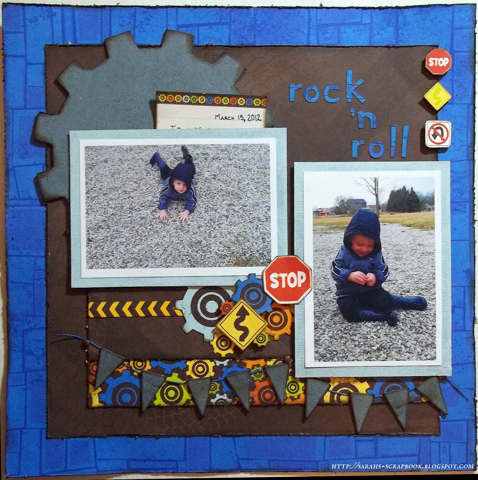
Rock 'n Roll

I finally found some time to scrap and got a new layout done tonight! This one came together really quickly, even though it is kind of outside my normal style. I used the Sassy Scrapper March Sketch for this layout and the new Bo Bunny On the Go collection (so cute and perfect for my little guy). I took the pictures earlier this week - we've had some amazing early Spring weather here in Southern Ontario, so we took advantage of the gorgeous day and went to the park (even though poor Will hasn't been feeling that great).
I followed the sketch pretty closely for this challenge - just making a couple of minor adjustments with the banner and the cluster of embellishments in the centre. All the papers, with the exception of the photo mats and journal card, are from the Bo Bunny On the Go collection. I lightly tool-distressed the edges of all the Bo Bunny papers and then inked them with Distress Ink in Walnut Stain. The photo mats are Core'dinations paper which I sanded to get the faded/distressed effect. I popped the photos up on the layout with 3D foam adhesive. I fussy cut the traffic signs and cogs from the Bo Bunny papers for the embellishment cluster in the centre of the layout and the three signs on the right side of the page and added dimension by adhering some of the cut-out elements with 3D foam adhesive.
I used a large chipboard gear from a Maya Road coaster album behind the horizontal photo and some Jenni Bowlin chipboard elements for the banner. I treated all the chipboard pieces with Distress Stain in Stormy Sky and then inked the edges with Distress Ink in Walnut Stain. I used a few nail-head brads to attach the twine for the banner. I used a double swag for the banner instead of the single swag on the sketch so that it would better frame the layout/photos.
I used a border strip from the Bo Bunny cut-outs sheet with some My Mind's Eye lined cardstock to create a journal card, which I tucked behind the horizontal photo. I'm trying to make myself journal more for my layouts - so hidden journalling is great because I don't usually like to mess-up my layouts with my (often) terrible handwriting.

Thanks so much for visiting my blog!

Materials Used:
Patterned Paper - Bo Bunny "On the Go" collection - Combo StickersCut-outs, Gears, Roads, and Signs; My Mind's Eye "Lost and Found" collection - Market Street "Love" Demure Paper; Core'dinations Essentials Collection in Vienna Lake; Jenni Bowlin Chipboard Elements; Maya Road Chipboard Gear from Gear Coaster Album; Distress Stain in Stormy Sky; Distress Ink in Walnut Stain; Karen Foster Designs Scrapper's Spool Twine in Cobalt, Blue Gel Pen; Memory Tape Runner XL; Glue Dots Memory Book; Memory Makers 3D Foam Adhesive.

Tuesday, March 13, 2012

Are you a Good Witch or a Bad Witch?

I've been so busy that I've hardly found time to scrap for over a week - but I finally finished the second layout that I had started on my all-day crop on March 3rd. This is another layout of me and my sister; this picture was taken about four years ago. It is my absolute favourite "grown up" picture of the two of us together. My sister and I both love the movie "The Wizard of Oz" and my sister teases me all the time that I am a witch and then I ask her where her flying monkeys are... Anyhow, inspired by our mutual teasing, here is my layout entitled Are you a Good Witch or a Bad Witch.
With the exception of some Black Core'dinations paper used as the photo mat, all the elements of this layout are from Graphic 45's "Wizard of Oz" paper collection. I tried to get a 'shadow-box' effect with this layout and cut the centre out of the Wicked! paper to frame the layout. I layered the frame on top of the Goblin Gazette paper using 3D Foam Adhesive. Here is a close-up of the layers/dimension in this layout.
I tool-distressed all the papers for the layout and did a lot of fussy cutting. I used an edge punch for a small strip of paper (the reverse side of the Goblin Gazette paper) that I placed inside the top edge of the frame. I used a collage of compasses that I fussy cut from the Wicked! paper as the background for the photo. I also cut the flying monkeys (gotta have flying monkeys!) from the Wicked! paper and used them as a 3D embellishment. The postage stamps are cut from the Parcel Post paper -- you'll notice that they are strategically placed to emphasize who the good witch is (me of course!) and who the bad witch is. I used some of the Emerald City paper and a paper doily that I inked with Distress Ink in Black Soot as layering and as the background for the title. I also added the Wicked Witch of the West square cut from the There's No Place Like Home paper. I assembled the layout intentionally placing all the elements so that the image of Glinda from the Goblin Gazette page at the base of the layout would still show.

For the title, I used a combination of Kaiser Craft tiny alphas in Raisin (for the words "Are you a .....or a...") and Thickers Foam Stickers from the Nightfall collection (for the words "Good Witch ...Bad Witch").

That's all for today! Thanks so much for visiting my blog!

Materials Used:
Patterned Papers - Graphic 45 "The Wizard of Oz" - Emerald CityGoblin Gazette, Parcel Post, There's No Place Like Home, and Wicked!; Core'dinations Tim Holtz Distress Collection Black Soot; Kaiser Craft Tiny Alphas in Raisin; American Crafts Thickers Nighfall Collection in Black Elm; Paper Doily; Tim Holtz Distress Ink in Black Soot; Memory Tape Runner XL; Scrapbook Adhesives 3D Foam Squares

Monday, March 5, 2012

Sisters

I went to an all-day crop on Saturday and got TWO layouts done! (Well - really about one and three-quarters - I'm working on the final embellishing on my second layout.....) It was great to have a whole day with my scrappy friends and relax and have some crafty fun. I scrapped a photo of my sister and I from when I was a baby - I think the photo was taken c.1976. I used the March sketch from the C'est Magnifique blog and The Color Room Palette #100 for this layout.
I used Graphic 45's "ABC Primer" Collection and a little bit of DCWV (the butterfly paper) for this layout. The background page, polka dot, ruler, alphabet and addition papers are all from the G45 "ABC Primer" Collection. I added the DCWV butterfly paper to make the layout a little more girly and also to bring in some of the pink for the Color Room Palette. I distressed all the papers for this layout with a tool distresser (no ink this time). I used Core'dinations Cardstock for the light pink punched border (left side of layout) and I sanded and distressed brown and blue Core'dinations paper to use as matting for the photo. I love how the blue mat really helps the picture pop on the page.
The title is inside a Tim Holtz Ornate Plate with some sanded brown Core'dinations paper behind with Kaisercraft Tiny Alpha stickers for the title letters. I fussy cut some butterflies out of the DCWV papers and added some twine linking the path of butterflies up the right side of the layout.
I made the burlap ribbon flower using a Gluber and added a wooden button (kindly donated by my friend Kelly) with a twine bow as the flower centre. The key is from the bargain bin at Michael's and the wooden fob-watch is by Kaisercraft. The tags are fussy cut from the G45 paper. The journalling reads: "Even a baby sister can be a shoulder to lean on - always there for her big sister." My sister has been going through some difficult times lately and I've tried to be there for her as much as possible even though we live a fair distance apart.

Thanks so much for visiting my blog - and please leave a comment if you stopped by - I love to read them.
Materials Used:
Patterned Papers - Graphic 45 "ABC Primer" - Happy Go Lucky, Juming Jean, School Days, and One Two Buckle My Shoe; DCWV - Butterfly Paper; Core'dinations Cardstock in Rose Embroidery, Vienna Lake and Chocolate Mocha, Tim Holtz Ornate Plate; Kaisercraft Tiny Alphas in Rum; Cosmo Cricket Gluber; Burlap Ribbon, Twine and Wooden Button from Stash; Recollections Metal Key; Kaisercraft Wooden Flourish - Fob Watch; EK Success Border Punch; Glue Dots - Memory Book and Mini; Memory Tape Runner XL.

Thursday, March 1, 2012

Cherish - The Paper Mixing Bowl Challenge #1

Welcome to my first reveal for The Paper Mixing Bowl Challenge Blog! I love participating in challenges and I am so excited to be kicking off my very own challenge blog with some great scrappy friends. I hope you enjoy this month's challenge and will hop on over to The Paper Mixing Bowl blog and play along! For my layout for this challenge, I scrapped one of my absolute favourite photos of my son....isn't he just the cutest baby ever?!?!?
Here is the recipe card for the challenge:
I have used the "main ingredient" - dark chocolate coloured paper - as the background page and in the flowers, paper ruffle and layering under the photo. I followed my sketch (i.e. the "measurements") fairly closely and I managed to use all six "utensils" on the layout too.  I used a combination of Pion Design, Fancy Pants Designs and My Mind's Eye papers for this layout. I've done lots of layering (in squares) and distressed the edges of all the papers. I also stitched a couple of the layers for a little extra detail. The title is a chipboard word by Dusty Attic that I treated with Distress Stain in Stormy Sky and Distress Stickles in Clear Rock Candy. The corner embellishments on the photo are also Dusty Attic and were treated with Distress Ink in Walnut Stain and Ranger Crackle Accents.

All the flowers for this layout are handmade and are based on a couple of tutorials you can find at Vicky Alberto's blog Simply Paper.
I also handmade the paper ruffle and added lace and a strip of distressed floral paper to complete the horizontal border on the layout. I think I might put together a quick tutorial of how I made this since I'm really pleased with how it turned out!
For my journalling, I used torn journal paper (or a close approximation using scrapbook paper) for a little handwritten letter to my son, which says: I love you more than the sun and the moon and the stars in the sky. You are my baby boy and I will cherish you always. I added some twine loops from the floral/journalling cluster to link the title and journalling visually.
Thank you so much for visiting my blog today! 
Materials Used:
Patterened Papers: Pion Design "Studio of Memories" Collection - Ornament, Anemone, Borders and Cut-out Sheet; My Mind's Eye "Lost and Found" Collection - Market St. Love Demure Paper, "29th St. Market" Collection - Mama's Curtain/Brunette Paper; Fancy Pants Designs "Lilac House" Collection - Weeping Willow and English Garden; Mulberry Paper (white flower); Dusty Attic Mini Corner #2 and Mini Word "Cherish"; Distress Ink in Walnut Stain; Distress Stain in Stormy Sky; Distress Stickles in Clear Rock Candy; Ranger Crackle Accents; Recollections Brads; Twine, Lace and Burlap leaves from stash; Glue Dots Memory Book and Mini; Memory Tape Runner XL; Terrifically Tacky Tape.