Saturday, September 29, 2012

Good Boy - CSI #38 and OUAS

Just a quick post tonight since it is so late. Insomnia is my nemesis of late.....I'm playing along again with CSI and Once Upon a Sketch. Here is my layout for this week and the "Case File" that inspired it!
This is the first time I have scrapped a photo of our dog Strider. We got him the year we moved into our home and had him for only four years - when we lost him to cancer. My journalling (on the tag tucked in on the left side) reads: "I don't know if you ever really get over the loss of a pet. Strider was our 'baby' before we had a baby and I still miss him. It makes me sad that we had so little time with him. He was our Good Boy."

My "evidence" for this layout includes: woodgrain, newsprint pattern, dog or pet accent (the bone paper), and flowers. Here are a couple of close-ups of the layout:


That's it - like I said - a really quick post tonight! Thanks so much for stopping by my blog!

Friday, September 28, 2012

My Layout is Featured on the Graphic 45 Blog Today!

I was so excited today when I visited the Graphic 45 Blog and saw that my layout - "Love" - was featured on their blog!

Wednesday, September 19, 2012

Daydream Believer - CSI #37 and OUAS

I just love the pairing of CSI and Once Upon a Sketch this month! For this week's challenge I decided to try something new and have done my very first Finnabair-inspired layout. If you don't know who Finnabair is - check out her blog - her work is AMAZING. I had a lot of fun getting dirty and making this layout - and I will definitely be trying it again. I definitely need to start saving more "treasures" (e.g. pop-tabs, random bits of hardware, etc.) for these types of layouts. I digress....here is my layout and the CSI Case File that inspired it.
Since I really had no idea where to start to create a "Finnabair-style" layout - what better place than her blog?! She has a fabulous video tutorial (via Live with Prima) on how to create this style of layout. To start my layout, I used a page by Basic Grey from their Basic Whites collection - love the notebook paper design of this page. I used a Crafter's Workshop 6x6 Paint Lids template and randomly inked some spots with Distress Ink in Black Soot; then, I used some Tattered Angels Glimmer Mist in Candy Apple Red. I layered torn pieces of  Bazzill Basics papers (Antique Dictionary and Antique Micro Dot) with a torn piece of notebook paper and used some pieces of Prima packaging for the two paper strips to the left of the photo and the larger circle on the right (under the clock face). I used a Michael's bargain bin frame and a photo of my sun from Summer 2011. For the pre-misting embellishments, I added some cheesecloth, Prima canvas resist shapes, fabric flowers, plastic gems, a resin embellishment and some paper reinforcers. I misted everything with three colours of mists: 1) Tattered Angels Glimmer Mist in Marshmallow, 2) Perfect Pearls Mist in Blue Smoke and 3) Tattered Angels Glimmer Mist in Raven.  (BTW - I LOVE how the plastic paper reinforcers resisted the misting!)
After misting, I added some additional embellishments (i.e. staples, the red flowers, black key and blue glass gems) and the title. The title is actually on the hinged flap that I tore off the back of the frame...kinda love how it looks on the layout! I called the layout "Daydream Believer" (for The Monkees song) and handwrote a simple message to my son (paraphrasing Eleanor Roosevelt), which says "Believe in the beauty of your dreams". The journal notepaper looked too white against the layout - so I added some Perfect Pearls pigment to it in Blue Patina.

Oh - I guess I should summarize how I "solved the case"!
  • Colour Scheme: I focused on the white, black and grey with hints of the red and blue.
  • Evidence: Use stripes and dots (lined paper and dotted paper), use wrappers/ packaging (Prima packaging - two strips on left and larger circle on right - under clock), use a book page (Antique Dictionary page used in layering), circles (lots - the masking uses circles and I added paper reinforcers too)
  • Testimony: Use a song title or lyrics as inspiration for your journalling, handwrite your journalling, write your journalling on note paper; Inspiration Word: -- daydream. The layout title is from the song "Daydream Believer" and I paraphrased a quote by Eleanor Roosevelt for the journalling, which says "Believe in the beauty of your dreams." I hope my son is a dreamer - and that he isn't afraid to follow his dreams....
  • Sketch: I followed it fairly closely - just playing with the size/positioning of the focal point and embellishments

That's it for tonight! Thanks so much for stopping by my blog. I love visitors and really appreciate your comments!

Materials Used:
Patterned Papers - Basic Grey - Basic Whites - Booknote; Bazzill Basics - Antique Dictionary and Antique Micro Dot; Crafter's Workshop 6x6 Template - Paint Lids; Distress Ink in Black Soot; Tattered Angels Glimmer Mists in Candy Apple Red, Marshmallow and Raven; Perfect Pearls Mist in Blue Smoke; Perfect Pearls Pigment in Blue Patina; Tattered Angels Vintage Hardware (Key); Recollections Flowers and Resin Embellishment; Jolee Boutique Flower and Plastic Gem; Prima Resist Canvas; Prima Packaging; Kaisercraft - Tiny Alpha Stickers in Black; Michael's discount mini frame; Glass Gem; Hilroy Graph Notebook paper; paper reinforcers, staples, Aleene's Tacky Glue.

Saturday, September 15, 2012

Love - CSI #36 and Once Upon a Sketch

I'm back with a new layout! This week I am playing along with CSI again - and it is an extra-special month at CSI because they have teamed up with Once Upon a . . .Sketch! I just love playing along with both these challenges - so this was a super-fun layout to do! I've used a picture of myself with my son when he was 3-months old. I don't have a lot of pics of me with him, since I am usually the one wielding the camera, but this is one picture that I just love. So, here is my layout and the CSI Case File that it is based on:
 Here is how I "solved the case":
  • Colour Scheme: I focused on the lighter tones in the scheme, with the darker orange and tan colours as my accents. I have also used black and kraft (i.e. cardboard) on the layout.
  • Evidence: Mesh (cheesecloth); Fibres (cheesecloth, ribbon, twine); tone-on-tone; curved, organic shapes (Dusty Attic chipboard floral element)
  • Journalling: I scattered my journalling words across the banner elements of the layout
  • Sketch: I followed it fairly closely - just tilting the picture and playing with the embellishments
For this layout, I have used Graphic 45's Olde Curiosity Shoppe Collection. The papers were perfect for the colour scheme for this challenge - and I adore everything Graphic 45 and have been dying to use these papers. Since I decided to use the tone-on-tone element of the challenge- I layered two similarly coloured papers with different patterns for the background to my page -- lots of distressing of the papers, with paper tears/rolls on the top page. I used a Martha Stewart deep-edge punch to create the horizontal border from the sketch using black cardstock - which ended up being mostly hidden by my embellishments, but I repeated the border-punch as peek-a-boos in the paper tears.
For the circle element of the sketch, I layered a circle cardboard that I ripped the top-layer off of to reveal the cardboard ripple texture with some cheesecloth and second circle of patterned paper. I then ripped a page out of an old dictionary (and had serious guilt about destroying a book) to use in the layering for my photo mat. I used simple black cardstock for the photo mat because I love how the black and white photo stands out on it. I used a Dusty Attic floral frame element, treated with Perfect Pearls Pigments in Copper and Gold, as well as a Dusty Attic mini word for the title, which I simply coloured with a black artist's marker. 
I made the banner using twine and cardboard and then added word elements from 7-Dots Studio Alpha Stickers for my scattered journalling. I added in some mulberry flowers, fussy-cut butterflies, tag elements from the Graphic 45 collection, and ribbon as my embellishments.

Thanks so much for visiting my blog today! Don't forget - I have a giveaway going on right now - check the right sidebar of my blog for a link!!
Materials Used:
Patterned Papers - Graphic 45 "Olde Curiosity Shoppe" Collection - Optical Oddities, Mercurial Masterpiece, Bazaar of Wonders, Parlor Wall, Tags #1; 7 Dots Studio "Domestic Goddess" Collection - Alpa Stickers - Salt and Pepper; Dusty Attic - Mini Word ("Love") and Floral Frame Set (Smaller Piece); Perfect Pearls Pigments - Perfect Copper, Perfect Gold; Perfect Pearls Perfect Medium; Recollections Boutique Fleur Mulberry Paper Flowers; Marvy Brush Marker - Black; Martha Stewart Deep Edge Punch - Garden Trellis; Black Cardstock, Cardboard, Twine, Cheesecloth, Dictionary Page; Michael's Special Value Ribbon; Aleene's Tacky Glue; 3D Foam Adhesive; Memory Tape Runner XL; Glue Dots - Craft and Mini.

Friday, September 7, 2012

Special Guest Artist - Ideas for Scrapbookers - Once Upon a Springtime Fairy House

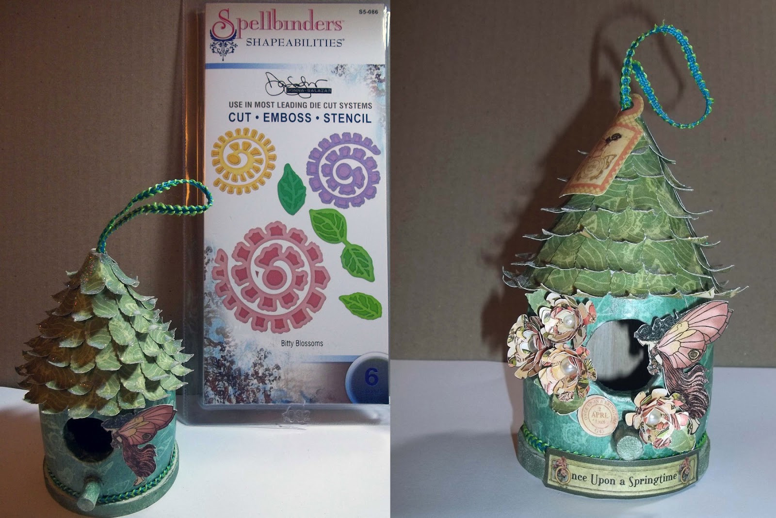
I was so excited when Pam, the owner of the Ideas for Scrapbookers blog, asked me if I'd be interested in being a featured designer on the blog sometime - of course my answer was YES! I actually had this little project in mind for a while - so this was the perfect impetus for me to actually sit down and do it! I love using my scrapbooking papers for off-the-page projects, such as home or holiday decorations, so I decided to create a lovely little Fairy House using Graphic 45's "Once Upon a Springtime" collection. It is so easy to take a cheap item, like the miniature wooden birdhouse I got for $1.50, and turn it into something beautiful using just your normal scrapbooking supplies! I hope my project inspires you to try your own off the page project!
Here is a little step-by-step how I created my Once Upon a Springtime Fairy House!

1. Paint the plain wooden house using an acrylic craft paint in Antique White.

2.  a. Cut a strip of paper the height of the main 'body' of the house and punch a hole for the bird-perch. 
     b. Mod podge the back of the paper strip and adhere it to the birdhouse. 
     c. For the large hole in the birdhouse, I simply cut a starburst pattern into the paper and folded the points inwards. 
     d. Finally, coat the paper with Mod Podge.

3.  a. Punch out a heck of a lot of leaves - I used the Martha Stewart Rose Leaf punch.
     b. Curl the edges of the leaves- I used a thin paintbrush.
     c. Attach the leaves in graduating layers using liquid glue.

4.  a. Brush the tips of the leaves with mod podge and sprinkle on glitter. I used DecoArt Glamour Dust - it is so pretty and very fine (and unfortunately doesn't show up well in the photos).
    b. "Stamp" the perch and white edge of the base with Perfect Medium and Brush on Perfect Pearls (I used Green Patina).
    c. You'll also notice that I wrapped some ribbon around the edge of the birdhouse where it meets the base - I thought this gave it a nicer finish at the edge. I used the same ribbon at the top of the birdhouse for the hanging loop.

5.  a. Fussy Cut a fairy from an 8x8 sheet of the Once Upon a Springtime paper.
     b. Coat Fairy with Mod Podge and adhere to birdhouse with 3D foam adhesive.
     c. Add floral embellishments - I used the Spellbinders Shapeabilities Bitty Blossom die to create the roses for the fairy house. I simply wrapped them around a paintbrush to roll them into the size/shape I wanted and then used a glue dot to keep them together. I added a pearl bead to the centre of each flower.
     d. Add other embellishments using Mod Podge - I used the "Once Upon a Springtime" tag elements for the tag, "title" piece and round postmarks. 

Here are a couple of photos of the final Fairy House from different angles!

Thanks so much to Pam for having me as a guest on her blog! I had so much fun with this project that I think I might make a couple more and create a little set!
Materials Used:
Patterened Papers - Graphic 45 Once Upon a Springtime Collection - 12x12 Once Upon a Springtime, Enchanted Forest, Butterfly Kisses, Tags; 8x8 Once Upon a Springtime; Simply Surfaces Mini Birdhouse; DecoArt Acrylic Craft Paint - Antique White; Celebrate It Ribbon; Spellbinders Shapeabilities Die Bitty Blossoms; Jenni Bowlin Studios Pearl Beads; Perfect Pearls Pigment Powder - Green Patina; DecoArt Glamour Dust; Mod Podge - Matte; Glue Dots - Mini and Craft

Wednesday, September 5, 2012

Memories - ScrapThat! September Sketch

A quick post tonight of a layout I created for the September Sketch at ScrapThat! I actually used the April ScrapThat! kit plus some extras from my stash for the layout. I loved the romantic sketch and thought it was perfect for a wedding photo. Here is my layout:
And here is the sketch that inspired this layout:
I followed the sketch fairly closely - just altering the position of the title and flowers. I added in a few "extras" too - like the lacing and the gorgeous Dusty Attic clock! I used Kaisercraft papers from their "Sweet Nothings" collection - lots of layering, distressing of the papers. I fussy cut the cream-coloured scalloped border from one sheet of the paper and distressed the edges, then layered it on top of a punched border strip. The pink scalloped border piece is from the Kaisercraft Charlotte's Dream collectables. The flowers are a combination of Prima and Kaisercraft. Once I finished the layout, it felt like it was lacking a little oomph - so I swiped on the gesso over the papers and flowers to "whitewash" the layout- I kinda like how that turned out. (FYI - using your fingers to swipe the gesso on the paper works a lot better than a brush!)
I just love this Dusty Attic clock - I painted it with gesso and then ran a soft-bristle toothbrush over it to clean the gesso out of the details. Then, I swiped some Perfect Pearls Pigment Powder in Green Patina onto the clock to make the numbers stand out. The lacing was inspired by my wedding dress, which had a corset-laced back.
Just one more close-up - the flower cluster and second lacing element on this page!

Thanks so much for visiting my blog today. 
Materials Used:
Patterened Papers - Kaisercraft Sweet Nothings Collection - Sincerely, Devoted, Love Letters, You & Me and Dozen Roses; Kaisercraft Collectables - Charlotte's Dream Collection (Pink Scallop Border); Bazzill Cardstock - Sand; Paper Flowers - Prima and Kaisercraft; Claudine Hellmuth Studio Gesso; Dusty Attic Vintage Clock #2; Perfect Pearls Pigment Powder - Green Patina; Basic Grey Opaline Half Pearl; DMC White Embroidery Floss; Martha Stewart Punch around the Page; Glue Dots - Mini and Craft; Memory Tape Runner XL.

Saturday, September 1, 2012

Play. Always. - The Paper Mixing Bowl September 2012 Recipe Challenge

I can't believe it is September already! The summer really flew by this year...I am NOT ready for it to be Autumn yet! *sigh* Oh well, a new month means a new challenge over at The Paper Mixing Bowl - and this month the theme was fun and games - with a Recipe Challenge of "Buttery Popcorn". Here is my layout and this month's recipe card!
The layout features my gorgeous little boy (of course) and I have used My Mind's Eye "Follow Your Heart - Be Amazing" papers. The main ingredient for the recipe was yellow - not my favourite colour, but I am happy with how it works on this layout. I used the yellow hexagon patterned paper as the photo mat and fussy cut the hexagons from one sheet of the MME paper as my repetitive shapes element. For my journalling, I simply used a 3D MME sticker and journalled about my son's favourite game - soccer. He loves it so much, he even wants to play it in the rain (as in these photos).

I also used some gesso and molding paste on this layout - I love the look of these but haven't experimented too much with them yet. For this layout, I simply swiped some gesso on the base page and then used a Chicken Wire mask and some light molding paste. Once the molding paste had dried, I brushed it with some Perfect Pearls in Blue Patina to make it stand out. I love how the masking turned out - and that it plays along with the recipe and is part of my repetitive shapes for this layout!
For my title, I played off the scrabble letter that was already on the MME paper and printed some digi scrabble letters from fuzzimo.com. The title also accounts for the game pieces element of the recipe. I chose the title "Play. Always" because my son loves to play - and I hope he always remembers to play and have fun - it is all too often that we forget that! I printed the scrabble letters on white cardstock, cut them out and adhered them to some chipboard using Mod Podge. I then trimmed them down and inked the edges with Distress Ink in Vintage Photo.
That's it for now! I hope you'll play along with the September 2012 Recipe Challenge at The Paper Mixing Bowl!

Thanks so much for visiting my blog today. 
Materials Used:
Patterened Paper: My Mind's Eye - Follow Your Heart - Be Amazing - Kraft Unique, Be the Best, and Honey Blue; My Mind's Eye Follow Your Heart - Layered Stickers; Claudine Hellmuth Studio Gesso (white); Crafter's Workshop Temlate - Chicken Wire; Golden Light Molding Paste; Ranger Perfect Pearls - Blue Patina; Digi Scrabble Letters - fuzzimo.com; Mod Podge (matte); Distress Ink -  Vintage Photo; 3D Foam Adhesive; Memory Tape Runner XL

Wednesday, August 1, 2012

Tropical Travelogue - The Paper Mixing Bowl August 2012 Challenge

It is time, once again, for a new challenge reveal at The Paper Mixing Bowl! This month the Recipe Challenge is "Margaritas" (mmm....tasty) - and the Main Ingredient is lime-green! I chose pictures from my honeymoon in Punta Cana for this layout - and did some photoshop doctoring to get the polaroid effect and sepia tone. Here is my layout and this month's recipe card!
Graphic 45's "Tropical Travelogue" collection was perfect for this layout - so much so that I used it as the title for the layout too! The base page of my layout is Core'dinations Kraft Core paper, which I sanded around the edge - I love how the sanded kraft-core looks like "sand" for my beachy, tropical layout! I used a torn piece of the Rainforest paper to anchor the central elements of the layout. I then layered some cheesecloth on top of that and then used a passport page that I cut from the Exotic Destination paper to mat the photos. The other paper embellishments (postage stamps, journalling spot, title, beach sign) are cut from the Exotic Destination and Paradise Postage papers from the G45 collection.
My non-paper embellishments include some seashells picked up in the Michael's bargain bin, some heavy twine and a couple of mini-clothespins - which I love! I took a couple of "dimensional" photos of this layout so you can get the full effect of all the 3D embellishments - the flat photos really don't do this layout justice!

That's it for today! I hope you'll pop over to The Paper Mixing Bowl blog and play along with this month's recipe challenge.

Thanks so much for visiting my blog today! Don't forget to enter your name for a chance to win some Scrappy Goodies in celebration of my birthday (link in the right sidebar)! 

Materials Used:
TBA

Thursday, July 26, 2012

Guest Designing at Scrap it With a Song - I'm Not Perfect, But I'm Worth It

In May, my layout "I Love You More" was picked in the Top 3 at the Scrap it with a Song challenge blog and I was invited to be a Guest Designer for one of the blog's July songs! This week's song is "Every Girl Like Me" by Sugarland.

I decided to use a wedding photo for this layout and have actually used the same picture three times but at different magnifications (thank goodness for Photoshop). I slightly modified two lines from the song and have called my layout "I'm Not Perfect, But I'm Worth It". I used the July Sketch from the C'est Magnifique blog and papers by Fabscraps from my July 2012 ScrapThat! kit for the layout.
I followed the sketch fairly closely for this layout - though I did make the circle slightly smaller and used it as the top layer of my layered papers. I also replaced the single photo with the three layered photos. All the patterned papers are from the Fabscraps "Organic" collection - and the Tan cardstock is by Bazzill. I distressed all the papers and used a Martha Stewart edge punch for the border at the bottom of the layering.
I added some lace from the July ScrapThat! kit to the punched border - the lace in the kit was white, which didn't look great on this layout, so I inked the lace with DistressInk in Antique Linen. I used the small paper flowers from the kit and added my own Prima and Zva Creative flowers from my stash, as well as a Zva Creative Pearl Flourish. I wanted to add a little something extra to the flower cluster, so I threw in a lace bow (also inked with Distress Ink) and a Pearl stick pin (from a previous ScrapThat! kit). The larger letters in the title are by Doodlebug Design Inc. and were included in the July ScrapThat! kit; the smaller letters are from my stash.

Thanks so much for visiting my blog today. Don't forget to enter your name for a chance to win some Scrappy Goodies in celebration of my birthday (link in the right sidebar)! 

Materials Used:
Patterned Paper - Fabscraps "Organic" collection - Tree , Herbs, Garden, Lace; Tan Cardstock - Bazzill; Flowers by Prima, Zva Creative and I AM ROSES; Pearl Flourish by Zva Creative; Cotten Lace Trim; Hero Arts Woven Lace Ribbon; Distress Ink in Antique Linen; Loopy Lou Letter Stickers in Beetle Black by Doodlebug Design Inc.; Diva Shimmer Alpha Stickers in Black by Making Memories; Pearl Stick Pin; Memory Tape Runner XL; Glue Dots - Craft.

Sunday, July 1, 2012

I AM Canadian - The Paper Mixing Bowl July 2012 Challenge

Well, it has been a month since my last post. I was hoping to get a lot more scrapping done - but I recently got a new job and have been so busy with it that it was hard to find time to scrap! But it is time for a new challenge at The Paper Mixing Bowl - so I had to find some time to get my DT Layout done - and I am so happy with this one! Here is the recipe card from The Paper Mixing Bowl for the July 2012 Recipe Challenge:
Since July 1st is Canada Day - I scrapped some photos of my son from last July 1st, which was his very first Canada Day! I've called the layout "I AM Canadian" - and for my fellow Canadians out there, you'll recognize the title as the slogan/logo from a Molson Canadian beer campaign from several years ago! Beer and Canada Day - wow, am I living up to a stereotype or what?
For this layout, I used papers from Fabscraps' gorgeous Classic and Shabby Chic collections for my layering, as well as as a woodgrain page by My Mind's Eye as the base page and photo mat. I followed the sketch fairly closely, but did lots of distressing of all the papers and added some extra embellishments. I also changed the journalling placement - and tucked a die-cut circular journalling card behind the photo mat - which simply states " William's first Canada Day - July 1, 2011".

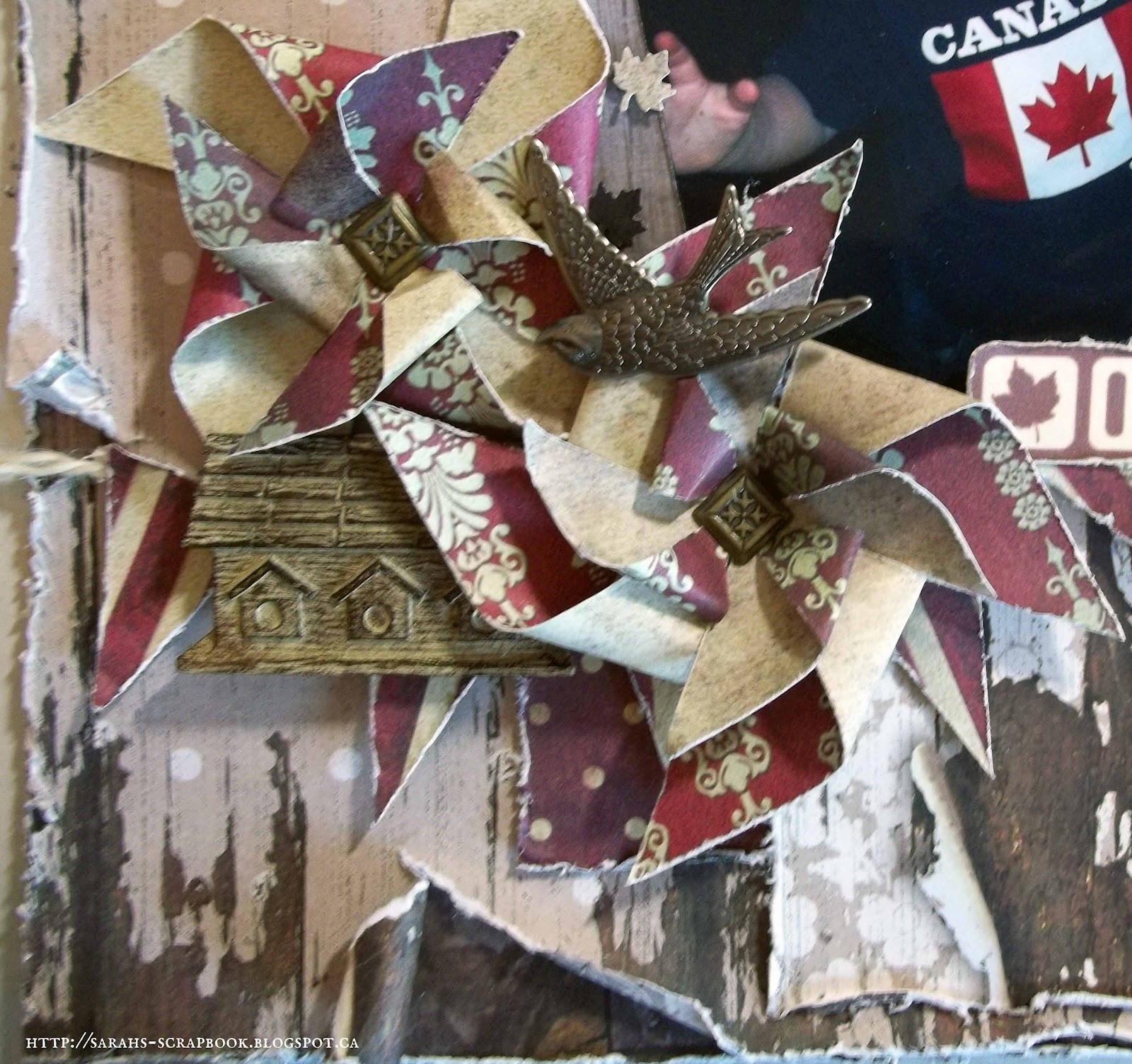
I used polka-dot, stripe and floral patterned paper in my layering to fulfill the recipe requirement of contrasting paper patterns. I also used some of the polka-dot and stripe papers to create banners in the top-right and bottom-left corners of the layout, respectively. In honour of summer and to create a star shape element, I used another patterned paper from Fabscraps Classic collection to create pinwheels for the layout. I added tiny pinwheels to the polka-dot banner and created large, double-layered pinwheels for the embellishments in the lower-left corner. I also punched some maple leaves from the different sheets of paper to create the maple leaf confetti that I added around the photos.
I added a Tim Holtz Idea-ology Bird Adornment and a Recollections Birdhouse to the embellishment cluster to complete it.
I hope you'll pop over to The Paper Mixing Bowl Blog and check out the July 2012 Recipe Challenge!

Thanks so much for visiting my blog today!
Materials Used:
Patterned Paper: Fabscraps "Classic" Collection - Rhythm, Red Stripe, Black Bird; Fabscraps "Shabby Chic" Collection - Stone Flower, Fleur; My Mind's Eye "Miss Caroline" Dolled Up "Living" Everyday Paper; Recollections Cardstock (Cream); Recollections Resin Embellishments (Birdhouse); Tim Holtz Idea-ology Adornments (Bird); American Traditional Designs - Square Brads; Round Brads from Stash; White Twine from Stash; Memory Tape Runner XL; Glue Dots - Mini and Memory Book.


Monday, June 11, 2012

New Blog: Erin Blegen: My Scrap Cabin

One of my favourite scrapbookers has started a new blog! Check it out - she has a great giveaway too!

Erin Blegen: My Scrap Cabin: Welcome to My Housewarming Party!! GIVEAWAYS!!!: Hello everyone and welcome to My Scrap Cabin!! If you're here because you were a follower of Scrappin' Sisters , I am relieved you have foun...

Friday, June 1, 2012

Daddy and Me - The Paper Mixing Bowl June 2012 Challenge

It is that time again - a new challenge is up for the month of June at The Paper Mixing Bowl. This month the Recipe is for Shish Kebab - with a main ingredient of Charcoal Briquettes. The journalling prompt was to "journal about a special man in your life" - so I used a picture of my DH and DS from last Father's Day! Here is this month's Recipe Card and my layout!
This layout actually came together really easily for me - and I am so happy with how it turned out. The base page (my charcoal element) is an embossed Core'dinations page that I lightly sanded so the clocks would stand out. I machine-stitched around the edge of the page, alternating a straight stitch and some zig-zag stitching.
I added some Bazzill Basics Antique Dictionary paper and I used Tim Holtz Kraft Resist paper (also with Dictionary Script) for the photo mat and tag. I attached the photo using coloured tape in charcoal. I distressed the edges of the papers and did lots of inking with Distress Ink in Vintage Photo. I added a twine tie, Tim Holtz Idea-ology reinforcer (not in close-up) and metal pin to the tag. The journalling on the tag (close-up coming) simply says "Playing with Daddy - Father's Day 2011". I used the Simple Stories Documented papers for the Bingo Card and Banner Elements on the page. I added eyelets to each of the banner flags and used  twine to string the banner. I added a Tim Holtz Idea-ology metal Clock Face and Game Spinner at the bottom corner of the photo and some Maya Road Wooden Calendar Numbers to the Banner; the numbers represent June 19, 2011 - i.e. Father's Day 2011.
For the title, I used Tim Holtz Idea-ology Tissue Tape in Symphony (the 'Dictionary' tape) and letter stickers from the Simple Stories Documented collection. I tried to get the last 'utensil' in by including brackets around the title element - but I didn't love how it looked - so I removed them!

I hope you'll pop over to The Paper Mixing Bowl Blog and check out the June 2012 Recipe Challenge. We also have a Design Team Call going on at The Paper Mixing Bowl - so check that out too!

Thanks so much for visiting my blog today!
Materials Used:
TBA